Reading Charts Makes You Smart
Often scientists and engineers will try to visually represent complex ideas, data or concepts using charts, graphs, cartoons and movies. Sometimes they help, and sometimes they are just confusing. Here are some examples and explanations to (hopefully) help make things clearer:
Charts
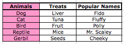
First, the vertical sections (up and down) are called columns (as in structures that hold up the colosseum)

See the structural similarities?
The horizontal sections (left to right) are called rows (as in a row of seats at a movie theater).

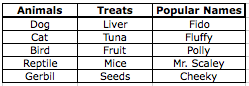
One, individual piece is called a cell.
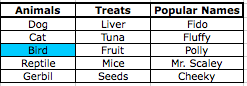
Usually, the bold titles of the columns tell you what to expect from the cells; in our example chart, we expect the column titled "Animals" to contain things like "dog" but not things like "peanut"
Sometimes, in complex charts, we have to use our knowledge of the cells to determine what the titles mean.
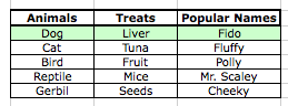
Let's try it with our example:
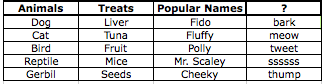
If we were missing a title for the new column, we could read all of the cells and come up with a guess. What would you call the missing column?
This type of guessing can help keep us from getting stuck on complicated charts while still getting some important information.
Next, let's look at a single line from a chart from the Centers for Disease Prevention and Control in the United States.
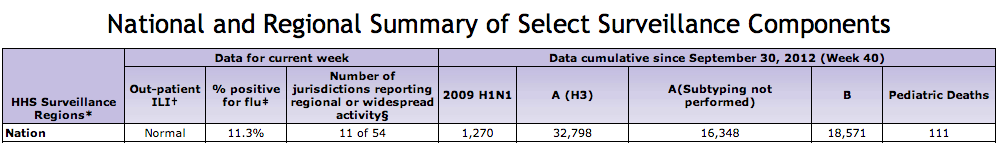
The first column title says "HHS Surveillance Regions" but without knowing what HHS means, it's hard to know what this column contains. By looking at the first cell in that column, we can see it is referring to the nation - so the "nation" is the "region" that the rest of the row will be about. That's probably all we need to know before we examine the next column - remember, it's a puzzle and we want as much information as possible! We can always come back to specific columns once we've seen the rest of them.
The next column title is "Out-patient ILI", but the cell just says "Normal" - we could spend time on this column, but it doesn't seem to offer us very much information. Let's keep going!
"% positive for flu" - Oh, that's interesting! It looks like 11.3% of the people tested in the whole Nation had the flu.
The next title is super-long! If we use the cell information (11 of 54) and insert it into the sentence, it tells us: Only 11 of the 54 regions in the whole nation reported widespread (a lot) of activity (flu patients).
The next four columns require us to know something about the flu in order to understand them; there are different strains of the flu - the 2009 H1N1 strain, the A strain and the B strain. Column 7 tells us that not every location tests this specifically for strains of the flu.
The final column is probably the statistic we would read in the newspaper "The flu killed 111 children nationwide for this flu season"
Let's consider that: If we only read the newspaper, it would sound like the flu was killing a lot of people. That's because the headline delivers the bad news out of context - only 11.3% of the entire nation tested positive for flu and our country has ~315 million people nationwide. While it is extremely tragic to lose a friend, neighbor, family member or other loved one, 111 people out of 315,000,000 people is a tiny, tiny fraction. To put the 111 further in context, 30,797 people died from car accidents in 2009.
Being able to read charts, even the intimidating ones, can help us to understand health, politics and financial concerns more clearly so that we can live longer, healthier and more fulfilling lives without being tricked by headlines or scams.